


In the framework of the SULTAN project, researchers from VITO and KU Leuven collaborated on developing an innovative solvometallurgical leaching method for extracting lead from zinc calcine and zinc leaching residue materials.
Read More »-

Selective Lead Extraction from Zinc Calcine and Zinc Leaching Residue
In the framework of the SULTAN project, researchers from VITO and KU Leuven collaborated on developi...
-

Press Release: “The Sami Perspective: a new mini-documentary”
The long-awaited mini-documentary “The Sami Perspective” is now available. The film tries to underst...
-

The Debrief. Made in Europe: from mine to electric vehicle
“Gripping & informative. Excellently presented!” “Eye opening” “Thoroughly informed science communic...
-

Solvometallurgical Process for the Recovery of Copper from Chrysocolla
Within the H2020 MSCA-ETN SULTAN project (https://etn-sultan.eu/), VITO and KU Leuven researchers de...
-

Natalia Pires Martins defends her PhD on calcium sulfoaluminate binders from alternative resources
On February 28, 2023, Natalia Pires Martins successfully defended her PhD thesis entitled “Use...
SULTAN - European Training Network for the Remediation and Reprocessing of Sulfidic Mining Waste Sites.
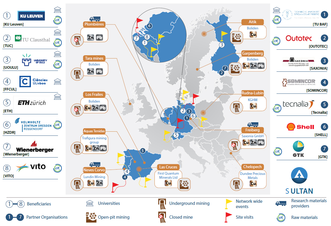
For more than 100 years the EU mining industries have been discarding their extractive-waste residues. Estimates suggest this represents 29% of the EU-28’s current waste output. When poorly managed these residues are a significant environmental hazard. Sulfidic Cu-Zn, Zn-Pb and Cu-Zn-Pb tailings pose the largest challenge, as they are prone to acid mine drainage. However, these tailings also contain valuable metals. Recently, the European Innovation Partnership (EIP) on Raw Materials launched a “call to arms” to transform the “extractive-waste problem” into a “resource-recovery opportunity”. Additionally, the EIP has warned about the acute shortage of talent in this sector. In order to develop a highly skilled workforce, to mitigate environmental risks and to economically recover valuable raw materials, the ETN for the remediation and reprocessing of sulfidic mining waste sites (SULTAN) provides the first-ever training programme dedicated to the reprocessing of tailings. SULTAN has pooled the interdisciplinary and intersectoral expertise of leading EIT RawMaterials members, world-leading mining and chemical companies, covering all the links in the tailings-reprocessing value chain.
SULTAN Infographic:For more than 100 years the EU mining industries have been discarding their extractive-waste residues. Estimates suggest this represents 29% of the EU-28’s current waste output. When poorly managed these residues are a significant environmental hazard. Sulfidic Cu-Zn, Zn-Pb and Cu-Zn-Pb tailings pose the largest challenge, as they are prone to acid mine drainage. However, these tailings also contain valuable metals. Recently, the European Innovation Partnership (EIP) on Raw Materials launched a “call to arms” to transform the “extractive-waste problem” into a “resource-recovery opportunity”. Additionally, the EIP has warned about the acute shortage of talent in this sector. In order to develop a highly skilled workforce, to mitigate environmental risks and to economically recover valuable raw materials, the ETN for the remediation and reprocessing of sulfidic mining waste sites (SULTAN) provides the first-ever training programme dedicated to the reprocessing of tailings. SULTAN has pooled the interdisciplinary and intersectoral expertise of leading EIT RawMaterials members, world-leading mining and chemical companies, covering all the links in the tailings-reprocessing value chain.
Read more...
News
-

Selective Lead Extraction from Zinc Calcine and Zinc Leaching Residue
-

Press Release: “The Sami Perspective: a new mini-documentary”
-

The Debrief. Made in Europe: from mine to electric vehicle
-

Solvometallurgical Process for the Recovery of Copper from Chrysocolla
-

Natalia Pires Martins defends her PhD on calcium sulfoaluminate binders from alternative resources


